Tag Archives: art

Watercolor Painting Daily – Landscape

Landscape watercolor painting 7 x 22 inches

I have started a landscape watercolor painting last night.  It is a very odd size measuring 7 x 22 inches.  I have decided to try this landscape watercolor painted using the splatter method and in high key.  I started with a pencil drawing outline of the picture on cold press watercolor paper and tape the watercolor paper onto a board with painters green tape which can be easily removed after.  Then I mask sections of the drawing and cut out the areas I want to do.  I splatter watercolor paint onto the areas in layers and leave each layter to dry before I proceed with another layer.  The color I use is straightly from the tube only diluted with clean water.  I let this pure watercolor from the tube dries before I put on another layer so there is many layers one on top of each other before the section is finished.  Once the finaly layer is completely dry, I cover back this area and go on to the next.

www.DickBlick.com - Online Art Supplies

Art Exhibitions – MUSEUM OF CONTEMPORARY ART, Los Angeles

Museum of Contemporary Art

COLLECTION: THE FIRST 30 YEARS

Museum of Contemporary Art, Los Angeles

November 15, 2009 – June 15, 2010

On the occasion of its 30th anniversary, MOCA opens Collection: The First 30 Years, a permanent installation of its renowned collection. Comprising nearly 6,000 works dating from 1939 to the present day, MOCA’s collection is internationally regarded as one of the largest and most important collections of postwar art in the world….. read more

Watercolor painting – Study of dry brush technique

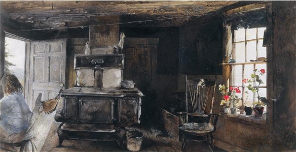
Andrew Wyeth "Wood Stove", 1962, dry brush on paper. 35x68 cm

I have recently read an article written by Peter V. Nielsen on drybrush technique. The title of the article is Drybrush – a watercolour technique explored by Andrew Wyeth.  I find it very interesting that Andrew Wyeth divide his watercolor into plain watercolor and dry brush.  He might start with plain watercolor techique but changes partly or fully into this more expressive dry brush technique.  After I read Peter Nielsen’s article and the Wood Stove painting by Andrew Wyeth in 1962, I want to try this myself but could not find much information on the web about this technique.

Watercolor Painting Dry Brush - Pear

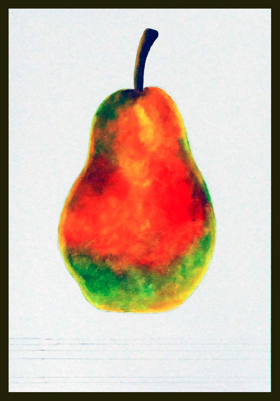
Then I found a site by an artist in Trento Italy called Ottorino De Lucchi.   He has develope a  dry brush technique over the years which allows the painting to maintain the brightness of the watercolor.  I saw his paintings on the web and it amazes me with the detail and brightness of it that I want to try it myself.  So I read his article on the technique which he generously share and started with a small study of a pear.  I have started with the dry brush technique he mentioned with layers and layers of dry color right from the palette but the result was needless to say, quite disappointing.  I have put layers upon layers of color to build it up as in Ottorino’s instruction but still I am not happy with the result.  I found that this technique is very time consuming and I have much to learn and to study about this dry brush watercolor technique.  Nevertheless I will try to finish this study in a few days and keep it as reference for my future watercolor technique.  Well, here it is showing my unsuccessful attempt on learning the dry brush technique.  I will write about it tomorrow and show my finish watercolor study tomorrow.

Daily Watercolor Painting Blog – Landscape

Landscape Watercolor Painting - 10 x 20 inches

This is  a 10 x 20 inches watercolor painting on Strathmore 140 lb watercolor paper.  Strathmore paper is made in the US by Strathmore Artist Paper in MN and they have an artist enewsletter you can sign up under the Artist Newsletter column in their web site………..  www.strathmoreartist.com

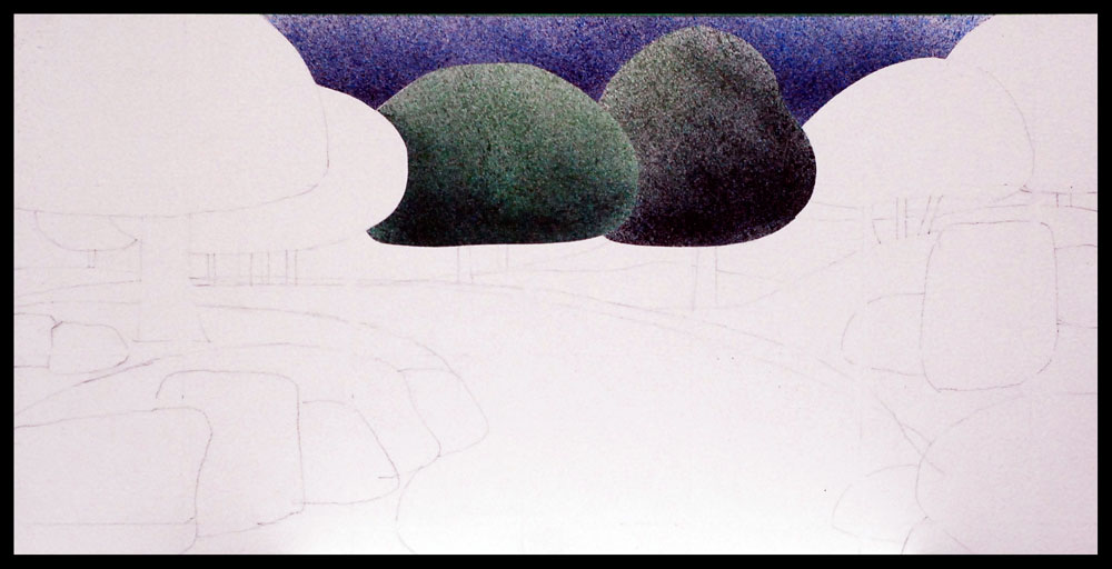
Last night I have made a sketch plan on the larger 10 x 20 inches watercolor paper and started the watercolor painting by splattering on the top sky section and two of the trees.   With a mixture of Winsor and Newton Ultramarine Blue and Alizarin Crimson, the sky was painted in layers of the different color mixture while other areas are protected.  Several layers of watercolor paint was splatter onto the paper while each layer is completely dry.

Painting Blog – New Watercolor Landscape

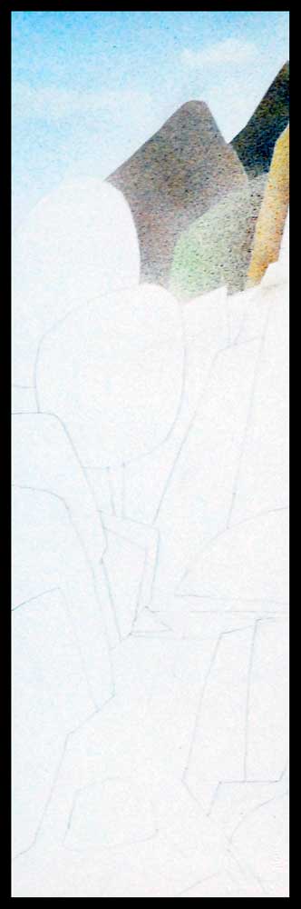
Watercolor Landscape Painting

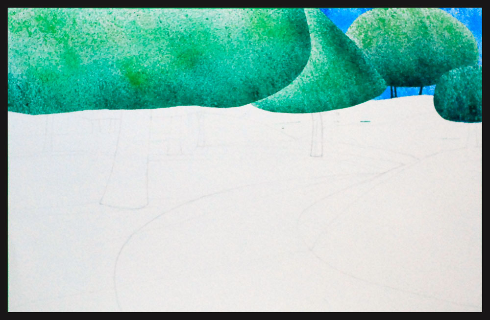
Started a new watercolor painting last night after I finished the painting the pebbles.  This is a new watercolor landscape painting on Strathmore 400 series which is a 140 lb Watercolor Paper available at many artist material supply such as Blick Art materials or Cheap Joes Art Stuff.

I have decided to do this painting with mostly splattering watercolor technique.  I started off mixing some light green watercolor paint for the large tree on the top row started on the left side.  With tape masking the rest of the areas I do not want any paint, I begin with painting the top reight area with my watercolor mixture.  Layers are left dry before another darker or different color layer is being put on top.  A variety of color is used and mostly are from Winsor and Newton Artist Watercolor tubes.  Colors used were Windsor Green, Hooker’s Green, Prussian Blue, Ultramarine Blue, Winsor Blue, Winsor Lemon, Winsor Green, Yellow Ochre and Alizarin Crimson.

Watercolor Art Painting – Pebbles

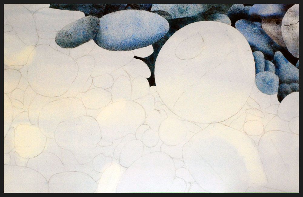
Watercolor Painting Art - Pebbles 15 x 22 inches

A continuation of my pebbles watercolor painting art project.  More pebbles are painted using the same watercolor technique.   Besides doing that I have looked up some information on the color Alizarin Crimson since artist should know their color.

Alizarin Crimson

Alizarin is a pigment that replaced the natural pigment madder lake.  Crimson is a name used for bluish red colors in general and the colors are between red and rose.  Alizarin crimson is a fugitive pigment and genuine rose madder is believed to be more permanent.  Genuine rose madder is made by traditional means using the root of the madder plant.  Alizarin crimson is a perfect color for many artists because it makes great neutrals and blacks when mixed with green, violet and blue.  When Alizarin crimson is mixed with French ultramarine blue it produces a beautiful violet.  Transparency rating for alizarin crimson is a 4 which means high transparency and is non-toxic.  Now many artist supply or material manufacturer have Alizarin Crimson under their choice of colors including Windsor and Newton,  M. Graham, Grumbacher, Daniel Smith  and Da Vinci to name a few.